Reflective Journal on Illustration for Cardiff Metropolitan University. My inspirations and research can be found at https://www.pinterest.com/rosewilkinson6/
After completing my Sahin Book, I wanted to create something that would act as a representation of my academic and theoretical journey over the past year. This zine encompasses many of the ideas and subject matter I have explored and I feel like it is a really good way to finish the studio work for the year; it allows the work to come to some kind of resolution.
All though short, I think this zine tells a complete journey of my explorations into Angela Carter and Femininity. I have used a snippet of the conclusion from my dissertation as it perfectly offset the themes present in Carter’s work. It adds context to the zine without having to add a large amount of writing to every page.
Some of the pages may seem a little more obscure and may be harder to understand the meaning. I wanted these to be more metaphorical, particularly in terms of the faces page. The faces are used to show the conflict between men and women, with the lady adorning herself as the typical picture of femininity wearing pearls and having rosey cheeks. This page does not have a quote or title on it as it does not come from a Carter story, but more from my own questionings of femininity, hence why it is in colour apposing all the other pages.
The repeated sticks page represents a part of the story where the man repeats a lino of story detailing how an owl flew onto a branch. The repetitive lino prints show how the story is repeated without explicitly illustrating it.
I hope to sell this zine and have it as part of the exhibition. I have never made or sold a zine before, so this will help add to my repertoire for professional practice. It will be interesting to see how successful they are as this could be a good for of revenue in the future after graduation.
Much of my design inspiration came from Sophie Lecuyer. I discussed her ideas previously when thinking of making a zine in the blog post titled “lino Printing: Playing with compositions”. I decided against having a completely hand printed zine as I felt like it did not honour the delicacy and craftsmanship that goes into print. It also would have taken a very long time and has not feasible to do with my hand situation. Therefore, a digitally printed zine makes far more sense for me. It also meant that I had a chance to practice further with Indesign and explore different graphic communication techniques. Below are some examples of the design inspiration I explored (including Sophie Lecuyer)(Images taken from Pinterest.com).
Today we took down the Spectacular Spectacular show after a successful weekend. I attended the opening night where many people turned up to see the show and meet the artists. This was the second exhibition I have been part of and was a really rewarding experience. It was interesting to see how my illustrations worked in the contexts of an exhibition.
I choose to display my embroidery hoops as I felt they best fit with the themes of the show. In my artist statement I have explained why:
“This project uses Embroidery and Lino printing techniques to illustrate stories from Angela Carter’s Book of Fairy Tales. These stories have particularly expressive and intriguing plots described in extremely lush and intricate language, therefore making them interesting subject matter.
Embroidery is nearly always a solely decorative craft with no real practical function, it is for this reason that I chose to implement the method into my work as it represents a ‘spectacle’. It is purely implemented into the work for its aesthetic qualities, and for these pieces it is used to add colour to otherwise plain shapes and lines.”
Initially I was planning on having more hoops to display, but after my hand injury I had no time nor did I want to injure my hand further by sewing. I think this would have given more presence to the show as my wall space looked really rather sparse. I think it would have furthered the fairy tale theme also as I would have been able to tell more stories rather than just two.
I began sewing another before my hand got damaged which was on blue fabric and I think this could have helped give my wall area a little more colour diversity and added something more interesting.
My practice over the course of level 6 has been a learning process that began focussing mainly on the practicalities of painting and learning more about the methodologies I used within my work. It slowly evolved, through the influence of the Dissertation module and the subject matter of Angela Carter, into something more conceptual and ideas based.
I’ve really tried to explore ideas of femininity and cultural diversity within my work. The femininity aspect came directly from my dissertation module, where I learnt a lot about the representation of women and the portrayal of women within the media and through art and design. I have explored this further to contextualise my work after discovering the number of sexualized imagery has grown with “the average number of sexualizing characteristics almost tripl(ing) over three decades” (De Melker, 2013), as stated by a study from PBS News. I tried to portray the women in my work as autonomous human being rather than sexualized objects. You can see the change in my character portrayal from the start of the year to now.
Below are some images of the woman created during the first term of Level 6. The women are shown nude, or nearly nude, draped in cloth and in a stance that suggests lethargy or in a position that enhances their feminine curves. None of the women here are shown in action or to really be doing anything that involves a thought process. They are completely objectified. Their pure and perfect skin and bodies seek only to defy the natural rather than embrace and praise it (Arnold, 2009, p89).
The very nature of the story Sahin resolves some of these issues. In this story the women are cunning and clever and lead the story. The Vizier’s daughter is that character which pushes the plot forward making her the most important, rather than a man as is so often found as a main character. Although not a nice character, the Vizier’s daughter is certainly nothing like the women above; she is inherently active and could in no way be represented in a passive way. This can be scene in the illustrations below where I show the women in action.
These women have personalities, but more than that, they have a purpose. They are not decorative or apathetic. I hope to continue to show women in this light as they truly are, and not just as objects for the male gaze.
I have also grown greatly in terms of visual language. My main aim from the start of Level 6 was to improve my painting skill and methodologies. I have developed an approach to painting where by I layer every single colour in order to enhance its vivacity and to add depth. This was a technique shown to us by Anna in some of the very first weeks of Level 4 and only now have I begun to use it. I think it has made a huge difference to my work and has completely re-defined my visual language. It adds a certain decisive blocky-ness to my shapes and forms making them more striking and interesting as subject matter.
Another technique that I have developed is the layering of watercolour and gouache as a form of backgrounds and blocking. This first grew during experimentation in the Grimm Brothers project I worked on (where I was shortlisted for the ‘The Reading Room’ Illustration Competition, 2016). Below you can see this page of development along with the finished version of the same scene.
One thing that was suggested by both Amelia and the external examiner was that the sketch book image perhaps said more as an illustration than the ‘finished’ version did as it had the small drawings and paintings around the edge. In all honesty I think they were simply doodles whilst I was waiting for the paint to dry! but on second glance they do tell a lot about the tale and add a certain playfulness aspect to the image; this is something that also comes across in the tale.
So far I have not had a chance to explore this form of visual language any further as I was mainly focussed on my painting technique as discussed earlier.
I have continued to use this layering gouache technique in the images for my Sahin book as I enjoy the texture it gives when the colours change and you can see the brush marks. it is reminiscent of traditional oil paintings such as The Girl in the Pearl Earing as an example. I like the way the two colours meet in a blocky stand off where suddenly there is a change even though very subtly. It is of great contract to the watercolour were we so often see a smooth transition in colour or tone. It is this contrast that I think makes the combination of the two mediums so exciting for me.
The Girl in the Pearl Earing, Vermeer
I also began using lino print as a visual language towards the end of the year. This was something completely unexpected but has added a whole new element to the way I work. I am keen to explore print further, perhaps moving away from block printing and exploring other printing techniques such as etching and drypoint. I hope to do this during my Masters course.
I have truly learnt a lot during the Subject module in terms of both skills and ideas. I hope that my work will resonate with its viewers and perhaps allow them to view stories, narratives or descriptions from my point of view, particularly as a woman and as an illustrator. I plan to continue my development during a Masters course at Camberwell University and am grateful for it.
I hope that my work will attract clients that are interested in something of high aesthetic value, but also of high moral value. I can see my work working well in the context of perhaps children’s literature to promote a healthy understanding of femininity and cultural diversity (this has been demonstrated in my book, Sahin, where the characters originate from across the planet) whether explicit or subtle. I also believe my work in this area could work well in editorial contexts for its narrative qualities.
A large part of my work this term has also been focussed around the theme of magic realism. I believe this has always been something evident in my work but has become more explicit during recent illustrations. I promote magic and fantastical elements within mundane situations allowing for my work to always have a lively and dramatic feel. I do this through the use of pattern and colour as well as the implementation of exotic and/or strange objects/animals in otherwise regular scenes. This has come from my deep fascination with fantasy and history and so I will often try to avoid modern or everyday scenarios. I think I will always do this in my work and this means I may isolate my self from particular types of jobs and clients in the future. For example, my work would not be suitable for a magazine centred around technology or cars, or for a job that included illustrations for a city scene. In a way I am limiting myself somehow, but I believe this makes my work more niche and perhaps I will be able to attract clients who are particularly interested in a magic realism type of illustration.
I started to designing the book weeks ago, and for this I am very grateful as I discovered quickly how many things needed to be changed in order to fit in the book and work successfully with my layout.
One of which was the lino print below. Originally I planned on using the image on the right as a small illustration to be integrated with text however, when I started to format the book I found it worked better as a full page spread and decided to try printing it in the inverted colours. This ended up looking really nice as a spread in the book, adding something new to break up what had come before
Spread from Sahin Book
I had also initially planned to have another double page spread in the book, but once everything else had been put in place, I found I had no space for it and trying to add it in would have looked forced and it would have brought down the flow of the book. I’m glad I figured this out before painting it as it meant I had more time to focus on fixing and perfecting other illustrations, such as the severed head as I have talked about previously.
I really tried to stick to a simple design for this book as I didn’t want the text to over power the illustration. Also the book will actually be quite large so it really doesn’t need to dominate to much of the page. I’ve tried to vary up the spreads in order to keep the viewer interested.
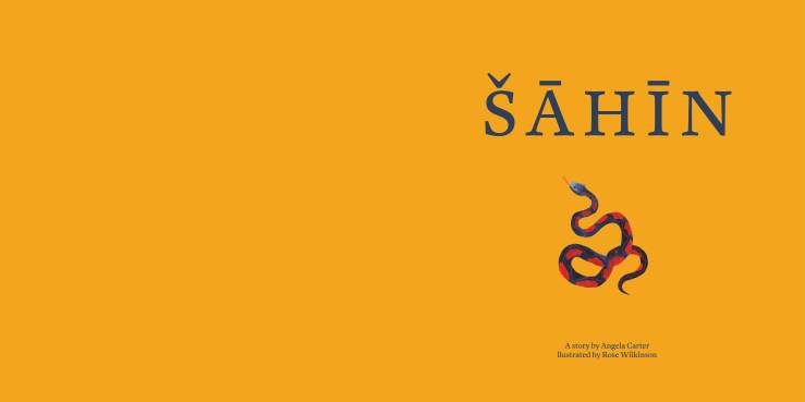
I also spent some time looking into the title page. As I’m not having a title on the front cover (I am having a fabric cover and a the circular lino print as a wrap), I had to plan something different to use here. As the title is Sahin, the name of a character, I wanted an image to go with it that would either represent him or something important in the story. I decided to use the symbol of a snake as I believe it has connotations relating to the story an my illustrations. The story comes from Angela Carter’s anthology of fairytales about women with a feminist point of view. This story in particular portrays the women to be clever, cunning and overall smarter than the men of the tale, in particular smarter than Sahin. I therefore used the Snake to represent Sahin for its connotations of the male phalice and evil – a symbol for the patriarchy. Sahin is also portrayed as a blue snake in the bath house seen where he and his eldest brother metaphorically watch over the women.
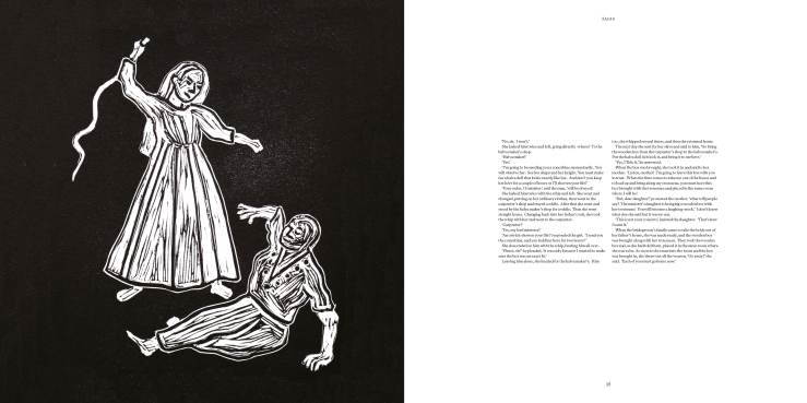
The last illustration of my book will be of a severed doll head. It took me a few tries to get this right and below you can see the transition.
The first painting took me very little time a tall and at first I was satisfied with it, but soon realised it could be improved upon. The red scarf is featured in all the illustrations of the Vizier’s daughter, but I decided to make it mean more in the second illustration. Here the scarf represents the blood that the doll does not have. I wanted the image to have a gory feel to it as the scene comes across in the book, but had to find a way around this. The scarf worked perfectly to achieve this. The pattern of the dots allows for views to question if this is blood or something else.
I like the style and ideas within the second illustration but felt the hair strands were too thick and came across rather like dread locks and could make the viewer confused about the identity of the head. I decided the best way to solved this was to repaint the head larger in order to make the strands look smaller.
I think the chunky, thick looking hair helps give the head a fake feel, as in, it helps make the head look more like a doll. As does the white eyes and smiling lips.
Technically, this was a difficult piece to paint. The hair strands were very fiddle-y and its difficult to gain the flat watercolour on such a large surface area especially navigating in-between small strands of hair at the same time.
This module, is one that I have perhaps felt the most comfortable with despite never having properly exhibited my work. I say this because, throughout the course, I have always enjoyed the sense of accomplishment you get when coming to the end of a project and when you have that physical object or piece of work to show that is an accumulation of all of your effort.
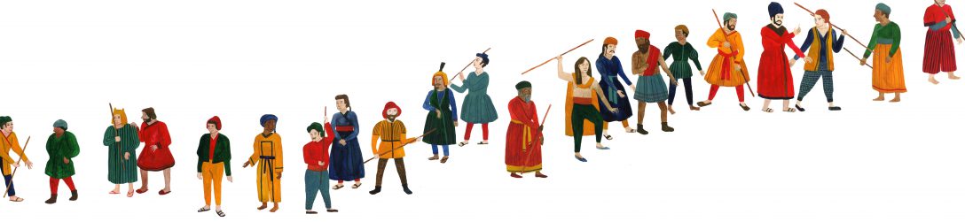
For me, I hope this will be the book of Sahin I am creating along with the original paintings and prints that will be featured in the book or have contributed towards it. I aim to demonstrate some insight into the key themes and debates Carter chooses to explore such as femininity and its meaning in our daily lives. I have done this throughout the consideration of the representation of my female characters. I hope that this will be seen in the context of the exhibition. I have also chosen to question race and culture in this book as I feel it is an important factor of the folk tale genre. My illustrations set the story in no particular place or time and I have tried to make this particularly evident in my portrayal of the metaphorical brothers. They are shown as ‘brothers of the world’. This mysterious setting is also notable in the coin illustration where old and ancient coins are illustrated from all over the world from many different eras. You can see a PDF of the book here: Sahin PDF for Blog
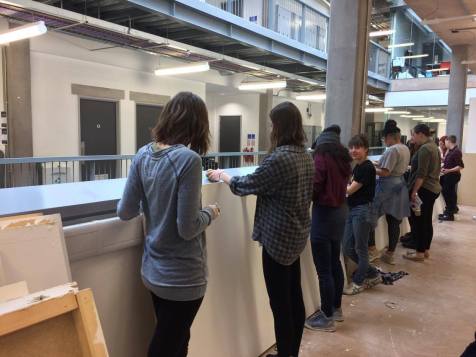
Setting up the degree show has been an incredible experience. It has been very hard work and worrying but so far (11.05.17) the space is looking really professional and exciting. I have chosen to have my work displayed on the midnight blue wall as I hope it will make my work stand out best as I use a lot of bright colours as well as a similar blue to the one on the wall. I debated having my work hang with golden bulldog clips and golden string as I felt it would bring out the opulent themes within the story of Sahin. It was decided by me and Amelia however, that the gold distracted too much from the paintings and the images work stronger when flush to the wall and simply hung. Although I was disappointed that I couldn’t use the royal gold elements, the final decision definitely looks better. Below is an image of me and the other students preparing the exhibition space.
(In case you missed my post about professional practice previously, here are the links again to my website, my CV and my Artist Statement):
Artist Statement: http://www.rosewilkinsonillustration.com/about
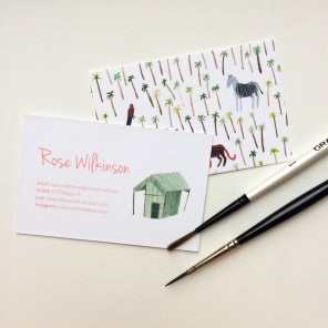
Buisness Cards:
I had been working on the professional practice aspects of my career for a while, slowly building up my portfolio website and my artist statement so it was important to really dedicate some time to perfecting it all and getting advice from the tutors. I also needed a portfolio for my interview at Camberwell for the MA, however this required a different selection of work, work that would show my potential. This included a lot of sketchbook and development examples.
I will also be re-contextualising some of my work into the exhibition titled Spectacular Spectacular organised by colleague Sophie Keen. The brief for the show asked for work that demonstrated something under the theme of a spectacle or spectacular. I decided my embroidery hoops would work well in this context, with embroidery being a highly aesthetic craft and therefore created solely as a spectacle rather than anything functional. I think these pieces work particularly well in this professional context due to the high levels of details and the fact that they already present themselves as an exhibition piece being “framed” in hoop.
Going forward, I have spent the last year of this course preparing myself well for the outside world. I have sent invitations to several illustration agencies and and publishing companies inviting them to the degree show in the hope that this may lead to freelancing jobs in the future. I have also got a project lined up with the Philosophy Magazine to do some illustrations for one of their articles and a commission for a lifestyle blog. I hope to being doing plenty of small commissioned work as soon as I finish in order to continue building up my portfolio.
After a week of resting my strained hand, I’ve become very restless when it comes to my work. It’s extremely frustrating knowing that I could be using my time to do some really great illustration but cannot. Therefore, I thought I would try something a bit different; I would paint using my left hand instead of right.
I thought I could perhaps make some loose, ‘wonky’ style paintings of scenes from Sahin that could go along side my book- I could possibly make them into a zine as I’m planning to do with my lino prints. I was inspired by the work of Sunniva Krogseth who creates these wonderful collages of shapes and patterns with incredible combinations of colour that give a celebratory vibe.
Sunniva Krogseth
Sunniva Krogseth
Sunniva Krogseth
I decided to attempt some wonky illustrations of my own, however, even though the whole point was for them to be imperfect, I still found the lack of control too deliberating. My images had no sense of purpose and just looked a mess. Perhaps with more practice I could master the technique, however I found after using my left hand to paint for more than 20 minutes, it would become achey and uncomfortable as I’m not used to using it.
I thought perhaps I could edit the images in photoshop as Sunniva Krogseth’s does would make them look better but even using photoshop seems impossible one-handed. The images appear to look slightly more purposeful when in black and white but still not as effective as I had hoped, especially as most of my work relies so heavily on the messages portrayed with colour.
I look forward to this Thursday when I can do some printing with the help of Tom Martin as I’m feeling very much at a loss without any ability to create.
Last Tuesday (30th March) I found out from the doctors that I won’t be able to use my right hand, specifically my index finger. This is because 2 weeks ago I was lino cutting for 3 days straight and must have completely over done it resulting in a very painful, swollen knuckle. Therefore I cannot paint, draw, print, etc. for two weeks. Luckily as I have organised my time fairly well thus far, I should be able to finish all of the actual illustrations in time for the hand in, but Amelia has kindly given me an extension to have the actual printed book finished in time for assessment. This means therefore, that I can keep illustrating and working all the way up to the deadline without having to worry about having the book printed in time.
During these 2 weeks of resting I’m trying to find other things to complete for assessment such as my CV which can be see here. I’ve also been updating my blog (typing one-handed as I am now!) and planning my desk display for assessment. On Thursday I am going to be going into the print studio where Tom Martin is going to be helping me to do the remaining Lino Prints for the show.
I’ve been trying to keep myself busy in this time. but I have found it extremely frustrating knowing I have more work to be finishing without any ability to do it. I only hope that my hand will have completely recovered after the end of the 2 weeks and I can finish all of my work.
Last week I, along with some other girls on the course, were given the opportunity to help one of the judges of the The Kate Greenaway Children’s Book Medal. We were able to have a good look at all of the books nominated for the awards and and evaluate them critically allowing for Martha to have an illustrators understanding of the books.
This was such a valuable experience as it meant we could see what goes in to making an award winning children’s book. It was actually really useful to see the ones that weren’t as successful either as it meant we could also see what not to do in our books. Martha gave us a list of criteria to think about whilst looking at the books that I will a;so be using to self analyze my own book.
The books we, as a group, felt were most successful were both by Flying Eye Books and were The Journey illustrated and written by Francesca Sanna and The Wolves of Currumpaw illustrated and written by William Grill (which I have discussed before in an earlier post). Both books had excellent pacing, beautiful illustrations, but overall had a strong sense of emotion and integrity.
The Journey illustrated and written by Francesca Sanna
The Journey illustrated and written by Francesca Sanna
The Wolves of Currumpaw illustrated and written by William Grill
The Wolves of Currumpaw illustrated and written by William Grill
Anna suggested that it would be a good idea to formulate a proper plan for the book now that I have most of the illustrations. Therefore, over the last few days I have been making a dummy book to show the pacing of the story and to get an idea of the page layout. Doing this exercise has actually made me realise there are a few places where I actually don’t need some of the illustrations I thought I would which will save me a great deal of time I can put into other parts of the book. However, it also helped me to see where some illustrations may need changing or re-thinking.
Here (Sahin_book) you can see the PDF of the Dummy book. some areas are blank where I still have some illustrations to complete and some illustrations are rough and may look different in the final book. Below is the rough printed version.