Dalton Maag Talk

I attended the talk held Dalton Maag last week, a typography design company originating from Switzerland. The talk was mainly directed at graphic communication students, but I felt it would be useful to attend as my book also has a lot of typography involved.

Although I didn’t understand a lot of the terms or technical details, the talk gave me a deeper understanding and appreciation for type and the meanings it conveys. The case study of the brand Lush I found particularly interesting as they discussed how they turned handwriting into a digital font whilst still insuring it looked natural. I experimented with this somewhat creating my own font, However without the knowledge of Dalton Maag, the overall effect was very ineffective and looked quite unprofessional so I decided it would be best not to continue with it. Below you can see an example of the font I created.

HANDWRITING EXAMPLE


Lino Printing: Playing with compositions

I decided that as well as paintings,  I wanted my story book to have some simple lino cuts as well. I hope that these will be a nice contrast to the watercolours whilst in keeping with the visual language.

Initially I hoped to also have some lino print typography implemented throughout the script as a way of enhancing repeated phrases and themes, however after trying them out in text they simply look too small to fit between the lines and you lost the detail of the lino. Below are the examples of these tests.

However, these phrases were still used.  I found, whilst printing, that different combinations of lino blocks would tell different stories; stories that would give the feeling and emotion of the story without telling a direct narrative (see below). I particularly think the composition of the whipping girl and “the one I love” is effective.

I intend to use these prints separately in the actual book but I’m hoping to make some kind of piece, or zine, the involves combining the prints as I think this is an effective form of illustration. This is very much inspired by the zine made by Sophie Lecuyer who uses a similar method.

The Bath House painting and The Eldest Brother

I really wanted the Bath House scene to have a sense of opulence and grandeur, but most of all, to feel magical. It needed to highlight the magic realism implemented within Carter’s work and I attempted to create this using nature.

We see and experience nature all the time in our everyday lives but it is when we stop to think that we are awed by it’s incredible abilities. It is for this reason that I implement nature into my illustrations to create a sense of magic and fantasy without stepping out of the boundaries of realism. For example, In the bath house image, the women bathe in a swimming pool full of plants with a tiger and snake watching over them.

I wanted to illustrate how the Brother’s were guarding the women, but as they were not actually inside the bath house in the story, I used the tiger and the snake to represent them; perhaps as Sahin and his eldest brother. I have done this by placing them in the corner and by painting them in similar dark colours to symbolise their complete opposition to the women.

Sahin, Bath House.jpg

Sahin’s Brother plays a large part of the story, so I choose to illustrate him at a part of the story where he jumps out on the Vizier’s daughter. I was very much inspired by the static portraits of the Indian and Persian miniature paintings that we see so often. Below are the two images my painting was based on.

I struggled to decide on the back ground as I didn’t particularly want to use another tone in guoache as I have been trying to limit my colour pallet. However, adding the blue I have been using as guoache has worked really well. I really loved the subtleties of the flowers in the Persian painting and so implemented these into my image using a green coloured pencil. I used the same plant designs from my large lino cut I used for the embroidery hoop. I’m hoping to use this lino as a wrap for the book. Below you can see the background process.

London: V&A and UAL

I was invited to go to London for an interview at Camberwell College of Arts for the MA Illustration course. This was also a great opportunity to visit the V&A Museum and to get a first hand look at the Indian Miniature paintings as well as some Japanese images that helped me choreograph the Bath House scene I have been working on. I have been so inspired by while working on my Sahin book.

Seeing these images up close was a real eye-opener to the actual size of them and how intricate the painting and details are but more than that, it was their opulence that really came across. They have a incredible vide of richness and power that I would love to try and emulate in my images somehow.

Whilst in London I also go accepted onto the Master’s course at Camberwell. I’m still considering this offer but I think it could be a fantastic opportunity to further my skills and knowledge of illustration.

Invitations, Business Cards and Website: Professional Practice

Recently I have been really exploring how I can get get myself and my work into the “real world”. This has included making some new business cards and also making a new website. After completing these two tasks I also sent out invitations to people working in illustration agencies, publishing and also newspaper companies. I hope that even if these people choose not to attend the degree show, perhaps they will look at my website or send me an email from my business card.

The invitations were each an original lino print with a handwritten letter on the back to hopefully make it all seem more personal and, ideally entice people into contacting me. Below is an image of the invitations:


I had a website deigned about a year ago that I used as a temporary portfolio however it very much needed updating so I changed things around with the colour and the layout to make it more personal and to better show off my work. here is the link: www.rosewilkinsonillustration.com

The business cards were very much based around the design of the website in order to keep a similar branding. I wanted them to show off my work but also feel quite playful and light. I wanted them to really draw people in therefore I chose work that wasn’t necessarily very narrative but more decorative as I thought it would work best in this context. They are also printed onto very thick, textured card that looks very similar to the watercolour paper I regularly work on. I think spending the extra money to have these business cards look so good will prove my professionalism and my dedication to having a freelance illustration business.

Buisness cards


Book planning

With 8 weeks left till the deadline, I think I have quite solid ida of how I want my book to look. Inspired by Jim Kay’s book (something I discovered at the start of this year when Kay did his talk- it was a very motivating way to start Level 6), I’d link to have a fairly large, nearly square book with two columns of text and illustrations interspersed in and out (see Kay’s book below).

David Wrenne, when I spoke about he layout ideas I had, showed me the illustrator Mirielle Fauchon and her book The Prisoner of Zenda. This book has fairly similar themes to the story I am illustrating, but it is the typography here that is really effective. It is striking but doesn’t distract from the illustrations, but compliments it. The two seem to work in sync and, after discovering this, I am interested in exploring a typographical approach to my book also. I am already planning to have some lino prints working as spot illustrations throughout, but I also think I might try lino printing some of the important words of the story and see how that works in the book.

After exploring her website further, I also discovered she too does a lot of lino printing, and has created beautifully printed books. The have a really narrative quality, mainly using silhouettes. I’m keen to explore her work further and I think she will be great influence over my lino prints in the coming weeks.

Peter Bruegel the Elder’s Characters

Last Friday Level 6 took a trip to bath to explore the museums and galleries. When visiting the Holburne Museum we saw an exhibition about the several artists/family members who worked under the name Pieter Bruegal.

Prior to this I had never heard of him but found his work had many similarities to my own, or at least similarities to the visual language and themes I desire from my own work. Mostly I found this within his character representation. The people he paints adhere somewhat to realism, but their round faces and body have a cartoon like feel which seems very out of place for the time they were created. It also seems unusual having these bubbly characters in scenes that are often of pain, fear and damnation.


Although the perspective in his images isn’t quite as warped as the Indian and Persian miniature paintings I have been studying, it still feels somewhat strange. Bruegel somehow manages to squeeze many characters, buildings, trees, etc. into one image.

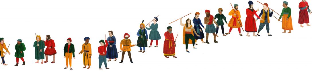
I have used his paintings, as well as Asian miniature paintings, as reference for an Illustration for the book I am making based on the story Sahin. Part of the story details 40 brothers, and so I decided to illustrate all 40 as part of a double page spread which is when I used these sources as reference. Below is a first layout draft of an idea of how the page will look.

Sahin brothers page layout draft

Although the image took a long time to make (nearly two weeks in between lectures and other work) I think it was worth it for the overall effect of having all 40 together on a page. The idea was to illustrate the brothers not as literal genetic brothers, but for them to be a band of ‘brothers’. They are all of different ages and races and I did this to give a message of diversity and friendship. I wanted to link all the characters whilst still showing that we all have differences.

After my talk with David Wrenne, the graphic design lecturer, today I have quite a clear idea of how I want my book to be laid out and he gave me some really good advice about playing around with typography to add a new element to my book.

Personal Statement

I am an Illustrator and Artist from Hereford currently studying at Cardiff School of Art and Design.

I am constantly inspired by the natural forms, shapes and patterns found within nature . I often seek the input of magic realism and find pleasure in expressing this enchantment within the mundane. This theme lends itself well to the narrative illustration I so often choose to explore and portray. I aim to create an outlet for escapism within my illustration and make illustrations that conveys a message, whether clear or subtle.

I’m interested in the re-defining of typically folkloric themes into contemporary contexts. I hope to bring elements and symbolism found within fantasy art and literature into commonplace situations or subject matter. This interest has come out of my preoccupation with Pre-Raphaelite paintings and the Golden Age of Fairy Tale Illustration in the 19th Century, and more recently, Indian and Persian miniature paintings.

My mediums of choice are watercolour, gouache, pencil and lino print, however I am also versed in digital image making using the Adobe Creative Suite.

I have worked for clients in a variety of areas of illustration including product design, editorial and branding, but I hope to expand my work into narrative contexts.

Painting Big and Picture Book Research

After my tutorial with Anna, it was suggested I experiment with my larger scale painting in the style I have been working on. She also recommended I consider how my characters where placed within the painting. We discussed the different possibilities of what to produce as a final outcome for the Summer Show. Anna Thinks my work would be best suited to a publication as she believes this would give a clear indication of the direction I want to take my work. However, I am still unsure as to what the publication will include. There is a strong possibility that I may simply create a picture book based around the story of Sahin from Angela Carter’s Book of Fairy Tales as it has a rich storyline with many illustrative possibilities.

Therefore I decided to use this story as subject matter for my large painting practice. I wanted to include the idea described by Carter at the start of her anthology where she describes how folk tales live outside of time and place. The stories are always based in a land that could be anywhere and anytime despite the origins of the tales. I have therefore tried to portray this in my image by depicting the characters in a variety of nationalities and in a place that would be anywhere. Below is the original painting.

sahin-painting-full-edited

I liked the painting I had produced. I thought the colours worked well, however, I was unsure about the composition. I felt that it wasn’t balanced; the top section did not seem to match the rest of the image and was too much of a distraction from the story being told in the bottom of the page. I decided therefore to crop this out and shuffle a few things around.

sahin-painting-crop

Compositionally this image works a lot better I feel and had much more of a uniformity about it. I also believe it works better as a piece of narrative illustration as there isn’t too much ‘going-on’ in the image. The viewer is invited to see what the women/princesses are doing in the image and to question the presence of the horse riders. I can see this image working well as a double page spread in a picture book.

I decided I needed to do some research into picture book formats and so I went to the book store, Waterstones, to have a look at some children’s books. I discovered a book by William Grill, an award winning illustrator from the UK, called The Wolves of Currumpaw. It tells a story of a group of wolves in the days of the wild west. I like the historical aspect of the story but it is the interesting compositional format and the beautifully simple illustrations that I find most enticing. (images below taken from http://nobrow.net/shop/the-wolves-of-currumpaw/).

I’d really like to experiment with these narrative techniques in the publication I will produce.

Bristol – AOI talk and Layla Holzer Exhibition

Last Friday (03/02/17) I went to Bristol with some friends from the course to visit Layla Holzer’s show opening called The Snow, the Crow and the Blood. The show was particularly relevant to my work as it revolved around the writing of Angela Carter whose words I am currently illustrating. However, the work Holzer had made seemed primarily to respond to the texts Carter has written herself rather than the compilation of Fairy stories I am focussing on. Having said this, the exhibition was still great to gather inspiration for the themes for Carter’s work. Holzer’s method of collage, painting and sculpture was really inspiring and is similar to the idea’s I have about what my degree show may resemble.

layla-holzer-exhibition
Image taken from http://laylaholzer.com/ from the exhibition ‘The Snow, the Crow and the Blood’

Whilst in Bristol we also attended a seminar from the AOI called ‘Making more money’. The discussion revolved mainly around the practical and legal aspects of being an Illustrator so was really helpful when considering our professional practice outside of University. There were some really useful tips about what to do and what not too, for example, don’t work for a day fee unless your doing a mural or visualisation; if the client doesn’t have enough money in the budget, offer to do something less or smaller; always remember to do personal projects and don’t be afraid for these to make up most of your website.

Overall it was a really helpful trip to Bristol, particularly in terms of being useful to the Professional Practice and Exhibition (Field) modules of the course at Level 6. I definitely came away feeling very much inspired to delve deeply into my illustration in this third term.