
My practice over the course of level 6 has been a learning process that began focussing mainly on the practicalities of painting and learning more about the methodologies I used within my work. It slowly evolved, through the influence of the Dissertation module and the subject matter of Angela Carter, into something more conceptual and ideas based.
I’ve really tried to explore ideas of femininity and cultural diversity within my work. The femininity aspect came directly from my dissertation module, where I learnt a lot about the representation of women and the portrayal of women within the media and through art and design. I have explored this further to contextualise my work after discovering the number of sexualized imagery has grown with “the average number of sexualizing characteristics almost tripl(ing) over three decades” (De Melker, 2013), as stated by a study from PBS News. I tried to portray the women in my work as autonomous human being rather than sexualized objects. You can see the change in my character portrayal from the start of the year to now.
Below are some images of the woman created during the first term of Level 6. The women are shown nude, or nearly nude, draped in cloth and in a stance that suggests lethargy or in a position that enhances their feminine curves. None of the women here are shown in action or to really be doing anything that involves a thought process. They are completely objectified. Their pure and perfect skin and bodies seek only to defy the natural rather than embrace and praise it (Arnold, 2009, p89).


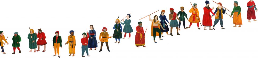
The very nature of the story Sahin resolves some of these issues. In this story the women are cunning and clever and lead the story. The Vizier’s daughter is that character which pushes the plot forward making her the most important, rather than a man as is so often found as a main character. Although not a nice character, the Vizier’s daughter is certainly nothing like the women above; she is inherently active and could in no way be represented in a passive way. This can be scene in the illustrations below where I show the women in action.


These women have personalities, but more than that, they have a purpose. They are not decorative or apathetic. I hope to continue to show women in this light as they truly are, and not just as objects for the male gaze.
I have also grown greatly in terms of visual language. My main aim from the start of Level 6 was to improve my painting skill and methodologies. I have developed an approach to painting where by I layer every single colour in order to enhance its vivacity and to add depth. This was a technique shown to us by Anna in some of the very first weeks of Level 4 and only now have I begun to use it. I think it has made a huge difference to my work and has completely re-defined my visual language. It adds a certain decisive blocky-ness to my shapes and forms making them more striking and interesting as subject matter.
Another technique that I have developed is the layering of watercolour and gouache as a form of backgrounds and blocking. This first grew during experimentation in the Grimm Brothers project I worked on (where I was shortlisted for the ‘The Reading Room’ Illustration Competition, 2016). Below you can see this page of development along with the finished version of the same scene.


One thing that was suggested by both Amelia and the external examiner was that the sketch book image perhaps said more as an illustration than the ‘finished’ version did as it had the small drawings and paintings around the edge. In all honesty I think they were simply doodles whilst I was waiting for the paint to dry! but on second glance they do tell a lot about the tale and add a certain playfulness aspect to the image; this is something that also comes across in the tale.
So far I have not had a chance to explore this form of visual language any further as I was mainly focussed on my painting technique as discussed earlier.
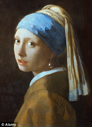
I have continued to use this layering gouache technique in the images for my Sahin book as I enjoy the texture it gives when the colours change and you can see the brush marks. it is reminiscent of traditional oil paintings such as The Girl in the Pearl Earing as an example. I like the way the two colours meet in a blocky stand off where suddenly there is a change even though very subtly. It is of great contract to the watercolour were we so often see a smooth transition in colour or tone. It is this contrast that I think makes the combination of the two mediums so exciting for me.
I also began using lino print as a visual language towards the end of the year. This was something completely unexpected but has added a whole new element to the way I work. I am keen to explore print further, perhaps moving away from block printing and exploring other printing techniques such as etching and drypoint. I hope to do this during my Masters course.
I have truly learnt a lot during the Subject module in terms of both skills and ideas. I hope that my work will resonate with its viewers and perhaps allow them to view stories, narratives or descriptions from my point of view, particularly as a woman and as an illustrator. I plan to continue my development during a Masters course at Camberwell University and am grateful for it.
I hope that my work will attract clients that are interested in something of high aesthetic value, but also of high moral value. I can see my work working well in the context of perhaps children’s literature to promote a healthy understanding of femininity and cultural diversity (this has been demonstrated in my book, Sahin, where the characters originate from across the planet) whether explicit or subtle. I also believe my work in this area could work well in editorial contexts for its narrative qualities.
A large part of my work this term has also been focussed around the theme of magic realism. I believe this has always been something evident in my work but has become more explicit during recent illustrations. I promote magic and fantastical elements within mundane situations allowing for my work to always have a lively and dramatic feel. I do this through the use of pattern and colour as well as the implementation of exotic and/or strange objects/animals in otherwise regular scenes. This has come from my deep fascination with fantasy and history and so I will often try to avoid modern or everyday scenarios. I think I will always do this in my work and this means I may isolate my self from particular types of jobs and clients in the future. For example, my work would not be suitable for a magazine centred around technology or cars, or for a job that included illustrations for a city scene. In a way I am limiting myself somehow, but I believe this makes my work more niche and perhaps I will be able to attract clients who are particularly interested in a magic realism type of illustration.
